Running the Restaurant
Restaurant Menu Design: Layout, Descriptions, QR Codes and Digital Menu Boards
How to design a restaurant menu that is easy to read and makes your best dishes easy to find: layout, writing descriptions, printed versus QR menus, and what to check before you buy digital menu boards.
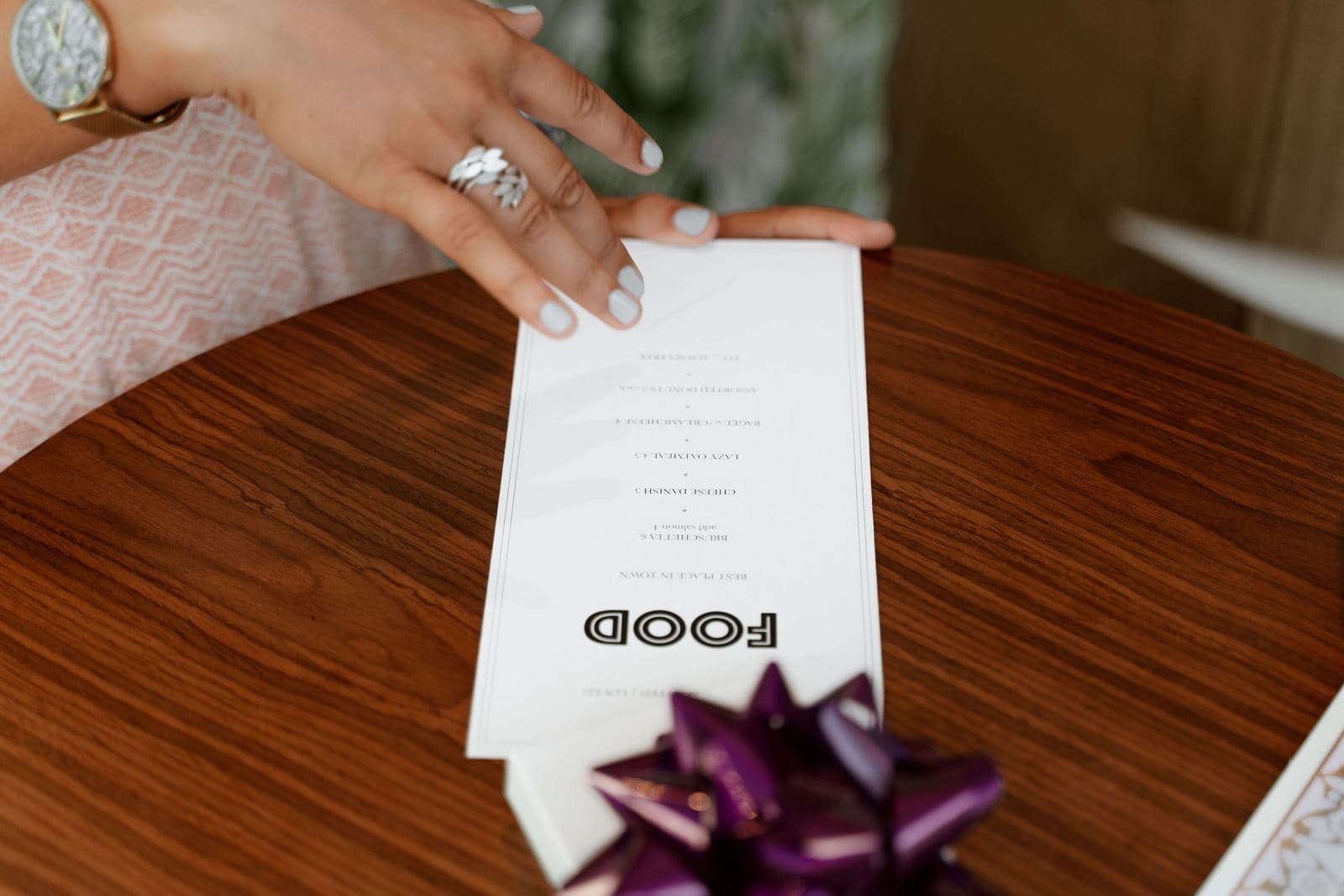
A good restaurant menu is easy to read in your dining room's real light, groups dishes into short clear sections, describes each dish honestly in one or two lines, and puts the dishes you most want to sell where guests will find them easily. Everything else (fonts, colors, paper, screens) serves that. Below: how to lay out the page, how to write descriptions, whether to use a QR code, when digital menu boards make sense and what to check before you buy.
We sell no menu software and no screens, and this page recommends no brands. Where we give a number, it comes from a named source listed at the bottom. Where the research is thin, we say so.
Start with the job of the menu
A menu has two jobs: help the guest decide quickly, and steer that decision toward dishes that earn you a good profit. Do the second job first, on paper, before you touch the design.
- Work out which dishes you want to sell more of. That is a numbers question, not a design question. Our guide to menu engineering shows how to sort dishes by popularity and profit.
- Know what each dish costs you. If you have not costed your plates, use the food cost calculator first.
- Then design the page so the dishes that matter are easy to find and look worth ordering.
Design cannot rescue a dish guests do not want. It can make sure a dish you are proud of is not missed.
How to lay out a menu
Layout comes down to reading order, section length and legibility. Here is what to do and why.
| Do this | Why |
|---|---|
| Group dishes in sections with plain headings (Starters, Mains, Sides) | Guests scan headings to find what they want |
| Keep each section short | A long unbroken list is hard to scan and hides your best dishes |
| Put the main course section where it is easy to find | One eye-tracking study (25 people, mock menu) found the entrees were read most carefully on the first pass |
| Use one or two typefaces | More than that looks cluttered |
| Leave white space around each section | Crowded pages are tiring to read |
| Print dark text on a light background | Low contrast is hard to read in dim light |
| Keep prices small, right after the dish name or description, not in a separate column | Prices are information, not the headline |
Where do guests look? The "golden triangle" is contested
Many menu guides describe a "sweet spot" where guests look first (often called the "golden triangle"), usually toward the upper right, and tell you to put your most profitable dishes there. One older map cited in the research puts the most influential area "just above the mid point of the right page." The evidence for this is weak. In a 2012 eye-tracking study published in the International Journal of Hospitality Management, Sybil Yang had volunteers read a mock two-page menu, and analyzed the data from 25 of them. She found that people read the menu like a book, and that "there is no one recency or frequency-based design sweet spot". The entree section was read most carefully on the first pass.
Two limits matter. It was a small sample reading a mock menu. And the study only tracked eye movements: it did not test whether menu design changes what guests order. So the honest takeaway is modest. Do not build your layout around a corner. Build it around a clear reading order, with section headings that let a guest jump to the entrees.
 A diner looking through a printed restaurant menu at a table
Be careful with design tricks
Boxes, icons, color and photos all draw the eye. Use them on a few dishes, not all of them. If every dish is highlighted, none is. For photos on a menu or a screen, see our guide to food photography for restaurants, and only show a dish if the photo looks like what the kitchen sends out.
Should you drop the dollar signs?
A Cornell study, "$ or Dollars" (Yang, Kimes and Sessarego, 2009), tested three price formats on lunch menus at one restaurant: a number with a dollar sign, a plain number, and the price written out in words. Guests given the plain-number menu spent significantly more than guests in the other two groups, although the format did not significantly affect total spending when compared with factors such as party size or time at the table. The restaurant was St. Andrew's, at the Culinary Institute of America, and the authors add that the findings "may apply only to lunch at this particular restaurant". That is one restaurant and one meal period, so treat it as an idea worth testing on your own sales, not a rule. It costs nothing to try: change the price format on one printing and compare average check with your last one.
A menu you can read in your own room
Before you print, check the menu where guests will read it:
- Print one copy at actual size.
- Read it at a table in your dining room at the dimmest time of day.
- Hand it to someone over 60 and someone who has never been in your restaurant. Watch where they hesitate.
- Fix what slowed them down, then print.
How to write menu descriptions
A good description tells the guest what the dish is, in plain words, in one or two lines. Lead with the main ingredient and how it is cooked. Add the one or two details that make the dish yours.
| Weak | Better |
|---|---|
| "Chef's special chicken" | "Roast chicken thigh, lemon, garlic, crisp potatoes" |
| "Our famous burger" | "Beef patty, aged cheddar, pickles, house sauce, toasted bun" |
| "A taste of the sea" | "Pan-seared cod, white beans, parsley, lemon butter" |
Rules that hold up in a real kitchen:
- Say what is in it. Guests with allergies or dislikes need the main ingredients, and everyone else wants to picture the plate.
- Be specific, not flowery. "Slow-braised short rib" tells a guest more than "heavenly".
- Only claim what is true. "House-made", "local" and "fresh" are promises. Use them only if your kitchen can back them up.
- Keep it short. If a description needs three lines, the dish may need simplifying.
- Keep the voice the same on every line, so the menu reads like one restaurant.
- Mention dietary information plainly (vegetarian, contains nuts) only where your kitchen can back it up and your staff can confirm it.
- Flag raw or undercooked food if you serve it. The FDA Food Code, a model that states and localities can adopt into their own food rules, requires a consumer advisory when animal foods such as beef, eggs, fish, poultry or shellfish are served raw or undercooked, for example a menu note or an asterisk to a footnote. Ask your local health department for the exact wording it expects.
We looked for solid peer-reviewed evidence on how much description length changes sales. We did not find a peer-reviewed source we could verify and stand behind, so we make no numeric claim about it. Test it yourself: rewrite descriptions for three or four dishes you want to sell more of, and compare how many sell over the next month.
QR code menu or printed menu?
A QR menu is cheap to update and a printed menu is always there. Which one fits depends on your guests and how often your menu changes.
| Question | Printed | QR code |
|---|---|---|
| Cost of a price change | New print run | Edit a file |
| Needs a guest's phone | No | Yes |
| Works without signal | Yes | No |
The guest without a phone
Not every guest has a smartphone. The Pew Research Center's 2025 mobile survey (5,022 US adults) found that 97% of adults aged 18 to 29 own a smartphone, against 78% of those aged 65 and older. A QR-only menu leaves out part of that older group, plus anyone with a dead battery or no signal. If you use QR codes, keep a printed menu for anyone who asks, and train staff to offer it without being asked.
If your menu is online, build it as text
The US Department of Justice says the ADA's requirements "apply to all the goods, services, privileges, or activities offered by public accommodations, including those offered on the web", and that there is no single mandated technical standard, but it points to the Web Content Accessibility Guidelines (WCAG) as helpful guidance. Practical steps for an online or QR menu:
- Make the menu text, not a photo of a printed menu. WCAG says to use "text instead of pictures of text", because people cannot adjust how text looks in an image.
- Use strong contrast. WCAG sets a contrast ratio of at least 4.5:1 for normal text against its background.
- Add a text description to every photo. The Justice Department's guidance notes that people who are blind cannot understand images when no text alternative is provided.
- Test on a phone, on a normal data connection, standing at a table.
This is not legal advice. If you are unsure of your obligations, ask a lawyer who knows your state.
Also keep your online menu consistent with your listing. Guests find menus through search, so make sure the menu on your website matches the one in your Google Business Profile.
 A chalkboard menu hanging on a wall inside a cafe
Digital menu boards: when they pay off
A digital menu board is a screen (or several) that shows your menu and can change without reprinting. The main benefit is speed of change. The main costs are hardware, software and keeping it all working. They make most sense when your menu changes often or your sales depend on a board that guests read from a distance.
| Good fit | Poor fit |
|---|---|
| Quick-service counter or drive-thru where the board is the menu | Table-service restaurant where guests hold a menu |
| Prices or specials change weekly, or by time of day | A menu that changes twice a year |
| Several locations that need the same menu | One small room with a chalkboard that works |
| Someone on staff owns updating the screens | Nobody has time to update them |
A chalkboard or printed board costs little and has a human look. Do not buy screens because they look modern. Buy them if the time and print costs you save are larger than what they cost you to run.
What to check before you buy
Ask every supplier these questions, in writing, and compare answers on the same basis.
- Total cost over three years. Add up screens, media players, mounting, installation, the software subscription (is it per screen, per month?), content design and any support plan. A low screen price can sit on top of a high subscription.
- Brightness and glare. If a screen sits near a window or outdoors, see it in your actual light at the brightest time of day. A screen that looks fine in a showroom can wash out in sun. Ask whether the screen is rated for the place you will mount it.
- Who updates the content, and how. Can you change a price in two minutes from a laptop, without calling anyone? What happens if the internet drops: does the screen keep showing the last menu?
- POS link. If prices on the board come from your POS, check that a price change in one place changes the other. If not, you will update everything twice and eventually the board will disagree with the bill.
- Reliability and repair. What is the warranty? Who comes out if a screen fails on a Friday night? Ask what happens to your content if you cancel the subscription.
- Readability from where guests stand. Test text size and contrast from the real distance. Prefer still, plain slides over moving ones.
- Rules that apply to you. If you are part of a covered chain, see the next section.
- Accessibility. Ask how a guest who cannot read the screen gets the same information (a printed copy, or staff who read it out).
 Baristas working beneath a row of digital menu screens in a coffee shop
Calories on menus and menu boards
If you are one of a chain of 20 or more locations, federal rules apply to your menu. The FDA's menu labeling rule covers "restaurants and similar retail food establishments that are part of a chain with 20 or more locations" operating under the same name, offering substantially the same menu items and selling restaurant-type food. They must show calories for standard menu items on menus and menu boards, plus a statement that "2,000 calories a day is used for general nutrition advice, but calorie needs vary", and a statement that "Additional nutrition information available upon request" (21 CFR 101.11). The compliance date was May 7, 2018. The FDA's definition of a menu includes electronic menus and menus on the Internet when they are the primary writing a guest orders from, so a digital board or an online menu is not a way around the rule. If you run fewer than 20 locations, the federal rule does not cover you, but your state or city may have its own, so check locally.
A simple order of work
- Decide the dishes to push, from your own sales and costs.
- Cut and group the menu into short sections.
- Rewrite descriptions for the dishes that matter.
- Lay it out with a clear reading order and strong contrast.
- Test a printed copy in your room at its dimmest.
- Pick the format (print, QR, board, or a mix) that fits your guests and how often the menu changes.
- Track the result against your last menu: item sales, average check and food cost percentage. Our restaurant technology guide covers the tools that can help, without recommending any one.
Sources
- U.S. Food and Drug Administration, "Menu Labeling Requirements": coverage (chains of 20 or more locations), calories on menus and menu boards, the 2,000-calorie statement, May 7, 2018 compliance date.
- U.S. Food and Drug Administration, "Food Labeling; Nutrition Labeling of Standard Menu Items in Restaurants and Similar Retail Food Establishments," Federal Register, December 1, 2014: definition of "menu or menu board", including electronic menus and menus on the Internet.
- U.S. Food and Drug Administration, "Food Code 2022", section 3-603.11: consumer advisory for raw or undercooked animal foods.
- eCFR, "21 CFR 101.11": nutrition labeling of standard menu items, including the "available upon request" statement.
- Sybil S. Yang, "Eye movements on restaurant menus: A revisitation on gaze motion and consumer scanpaths," International Journal of Hospitality Management 31 (2012): 1021-1029. doi:10.1016/j.ijhm.2011.12.008.
- Sybil S. Yang, Sheryl E. Kimes and Mauro M. Sessarego, "$ or Dollars: Effects of Menu-price Formats on Restaurant Checks," Cornell Center for Hospitality Research, May 2009.
- Pew Research Center, "Mobile Fact Sheet" (survey of 5,022 U.S. adults, February 5 to June 18, 2025): smartphone ownership by age.
- U.S. Department of Justice, Civil Rights Division, "Guidance on Web Accessibility and the ADA": ADA coverage of goods and services offered on the web; WCAG as guidance.
- W3C, "Understanding Success Criterion 1.4.3: Contrast (Minimum)" and "Understanding Success Criterion 1.4.5: Images of Text," WCAG 2.1.
Frequently asked questions
How do I design a restaurant menu?
Start with the dishes, not the design. Decide which items you most want to sell (see our guide to menu engineering), group the menu into clear sections, keep each section short, and make every line easy to read in dim light. Then write one honest, specific description per dish, print a test copy, and read it in your dining room at night before you order a full print run.
Where should I put the dishes I want to sell on a menu?
Put them where guests will find them easily: under clear section headings, and early in their section rather than buried in a long list. In one small eye-tracking study the entree section was read most carefully, so make that section easy to find, though the study did not test sales. The popular idea that diners look first at the top right corner (the 'golden triangle') is contested: an eye-tracking study of 25 people reading a mock two-page menu found no single sweet spot and found that people read the menu like a book. Design for reading order and clarity, not for a magic corner.
Should I use dollar signs on my menu?
There is no proven rule. One Cornell study at a single restaurant found that lunch guests given a menu with plain numbers (no dollar sign) spent more than guests given dollar signs or prices written out in words, but the authors say the finding may apply only to that restaurant. If you try it, test it on your own sales and keep the prices easy to find.
Is a QR code menu better than a printed menu?
Neither is better for every restaurant. A QR menu is easy to update and costs little to change, but it needs a guest with a working smartphone and a signal: 78% of US adults aged 65 and older own a smartphone, against 97% of those aged 18 to 29 (Pew Research Center, 2025). Many owners keep a printed menu available as well, so no guest is left without one.
Do I have to put calories on my menu or menu board?
Under federal law, only if you are part of a chain with 20 or more locations that does business under the same name, offers substantially the same menu items and sells restaurant-type food. In that case the FDA requires calories for standard menu items on menus and menu boards, and electronic or online menus count when they are what guests order from. Independent restaurants with fewer locations are not covered by the federal rule, but check your state and city rules, which can differ.